How to Increase Form Completion Rates: 7 Proven Strategies
Most forms lose over half their respondents before they finish. Here are 7 actionable strategies to reduce form abandonment and get more — and better — responses.
You spent an hour crafting the perfect form. You shared it with your audience. And then... 30% of people finished it.
That's not unusual. The average form completion rate sits between 20-40%, depending on length, audience, and context. For longer forms — anything over 10 fields — it's often worse.
The problem isn't that people don't want to respond. It's that most forms make responding feel like work. Here are seven strategies that actually move the needle.
1. Cut your form in half
This sounds obvious, but it's the most ignored advice in form design. Every question you add costs you completions.
Before adding a field, ask: "Will I actually use this answer to make a decision?" If the answer is no — or "maybe later" — cut it.
Common offenders:
- "How did you hear about us?" — Nice to know, rarely acted on
- Company size / industry / role — Do you segment by these? If not, skip them
- Phone number — Unless you're actually going to call them
A 15-question form cut to 7 doesn't just get more completions — it gets more thoughtful completions. People who aren't fatigued give better answers.
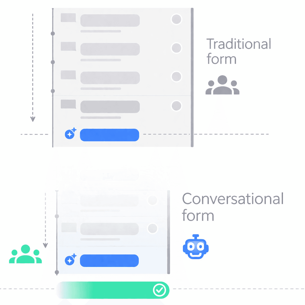
2. Show one question at a time
There's a psychological principle at play here: when people see a long list of questions, they estimate the effort and decide whether it's worth it. Often, it isn't.
Showing one question at a time removes that calculation. The respondent focuses on what's in front of them — not on how much is left. Each answer feels like a small commitment, not a large one.
This is why conversational forms consistently outperform traditional multi-field layouts. The format itself reduces perceived effort.
Practical tip: If you're stuck with a traditional form builder, at minimum break your form into multiple pages instead of showing everything on one screen.
3. Lead with the easy questions
The order of your questions matters more than you'd think. If the first thing someone sees is a textarea asking "Describe your experience in detail," many will bounce before they start.
Start with low-friction questions:
- Name, email, or a simple yes/no
- Multiple choice or rating scales
- Anything that takes under 5 seconds to answer
Save high-effort questions for later:
- Open-ended feedback
- Detailed descriptions
- Anything requiring thought or recall
By the time someone has answered 3-4 easy questions, they've invested enough to keep going. Psychologists call this the commitment and consistency principle — once we start something, we want to finish it.
4. Show progress (but do it right)
Progress bars work — when done correctly. A respondent who knows they're 60% done is more likely to finish than one who has no idea how much is left.
But there's a catch: if your progress bar jumps from 10% to 15% after answering a question, the remaining 85% feels daunting. The bar needs to move meaningfully with each step.
Best practices:
- Use a progress bar or step indicator (e.g., "3 of 7")
- Make sure each step moves the bar noticeably
- Consider a progress circle instead of a bar — it feels less like a loading screen
Avoid showing progress on very short forms (under 4 questions). It adds UI clutter without benefit.
5. Make it feel like a conversation
This is the single biggest lever most people overlook.
Traditional forms present a wall of fields: label, input, label, input, label, input. It's functional, but it's also cold, mechanical, and forgettable.
Conversational forms flip this entirely. Instead of filling out a spreadsheet, respondents have a back-and-forth dialogue. The form asks a question, they answer, and the next question adapts based on what they said.
Why this works:
- It mimics how humans naturally share information — through conversation
- It reduces cognitive load — one question, one answer, no scanning
- It enables follow-ups — if someone gives a vague answer, the form can ask for clarification
- It feels personal — even when it's automated
This isn't just a UX preference. Conversational formats consistently show higher completion rates and longer, more detailed responses compared to traditional form layouts.
6. Brand your form
This one surprises people, but it matters. A form that looks generic signals "this is routine, don't overthink it." A form that matches your brand signals "we put thought into this, and your response matters to us."
At minimum:
- Match your brand colors — not the default white/purple/blue of your form tool
- Add your logo — instant recognition and trust
- Use your voice — write questions the way your brand speaks, not in formal survey-language
A branded form doesn't just look better — it sets expectations. It tells the respondent this isn't a throwaway survey. Their input matters enough that you designed an experience around collecting it.
7. Optimize for mobile
Over 60% of web traffic comes from mobile devices. Yet most forms are designed on a desktop and tested on a desktop.
On mobile, the problems with traditional forms multiply:
- Long forms require endless scrolling
- Small input fields are hard to tap
- Dropdowns and date pickers are clunky
- Multi-column layouts break
Mobile-first form design means:
- Large, tappable input areas
- Single-column layout
- Minimal typing required (use buttons, toggles, and voice where possible)
- Fast load times — a form that takes 3 seconds to load on mobile loses a chunk of respondents before it even renders
Test every form on your phone before sharing it. If it feels annoying to you, it feels annoying to your respondents.
Putting it all together
These seven strategies compound. A form that's short, conversational, branded, shows progress, starts easy, and works on mobile will dramatically outperform a generic 20-field Google Form.
Here's the cheat sheet:
| Strategy | Impact on completion | Effort to implement |
|---|---|---|
| Cut form length | Very high | Low — just delete fields |
| One question at a time | High | Medium — depends on tool |
| Easy questions first | Medium | Low — just reorder |
| Show progress | Medium | Low — most tools support this |
| Conversational format | Very high | Low — use the right tool |
| Brand your form | Medium | Low — colors and logo |
| Mobile optimization | High | Low — test and adjust |
The biggest wins come from length, format, and mobile. If you only do three things, do those.
Want a form that handles most of this automatically? RuntimeForms uses AI to create conversational forms that adapt in real time — one question at a time, with follow-ups, branded to your company. Free during beta.
Ready to try conversational forms?
Create your first AI-powered form in under a minute. Free to use.
Get started for free